Sugarbird Gin wanted to penetrate a new market of craft gin lovers with a giftset that would be distinctive within a vibrant market, but still resonate with their current identity. Their existing minimal colour palette provided an opportunity to stand out next to their colourful competitors.
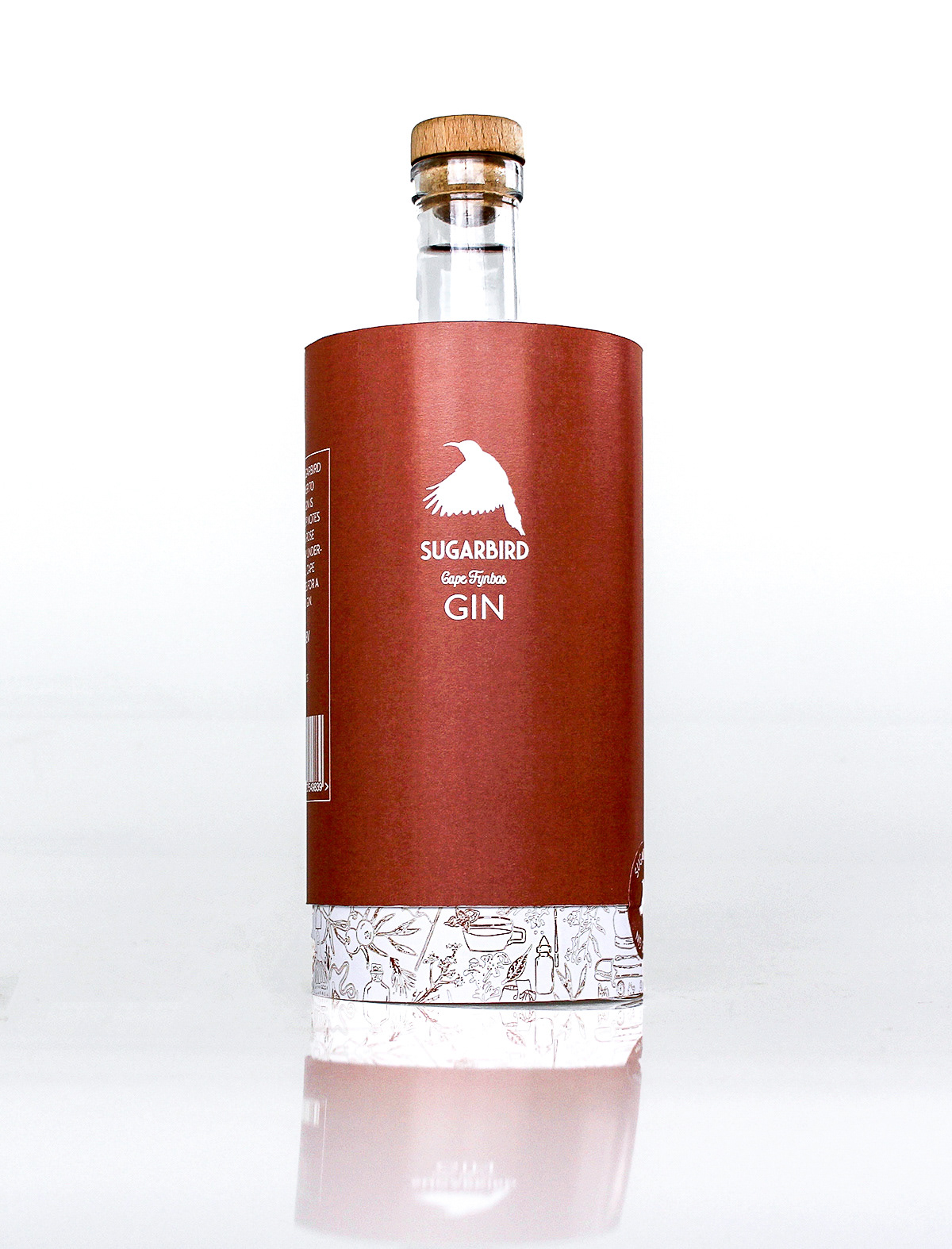
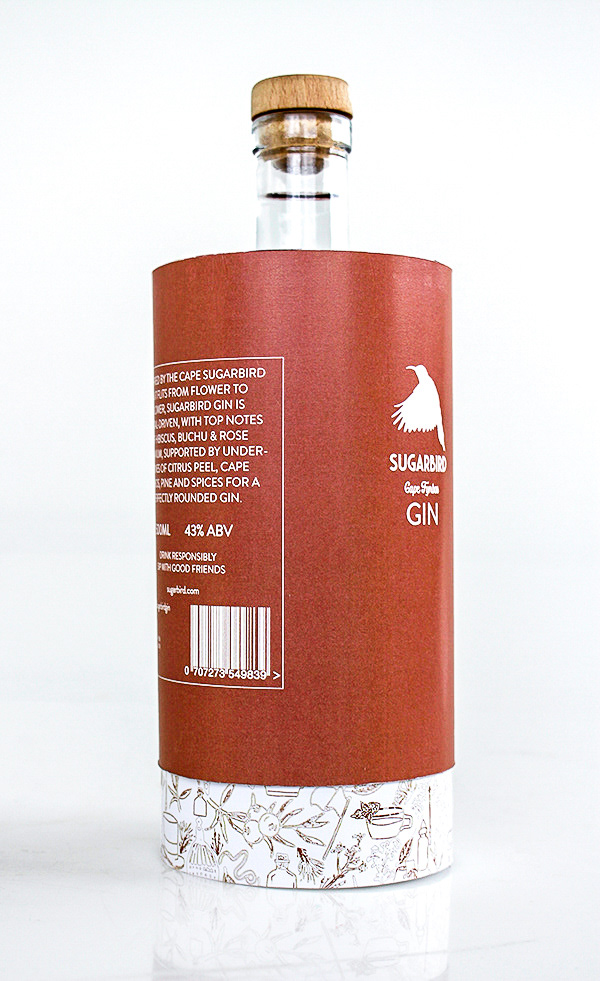
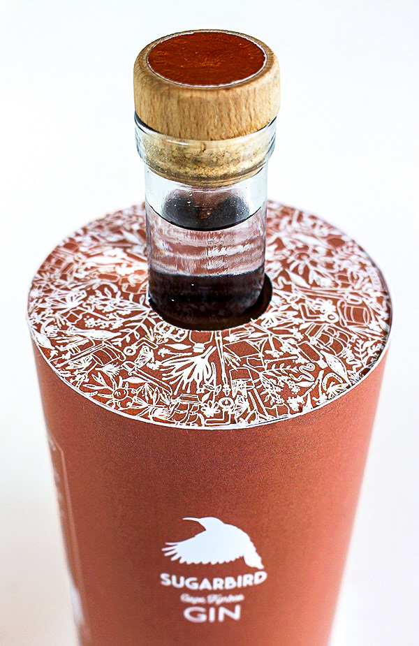
The concept for the secondary packaging itself lends value to the craft side of Sugardbird’s gin. Its metallic colour and cylinder shape are references to the distillery process, making it a bit more elite than the average looking gin.
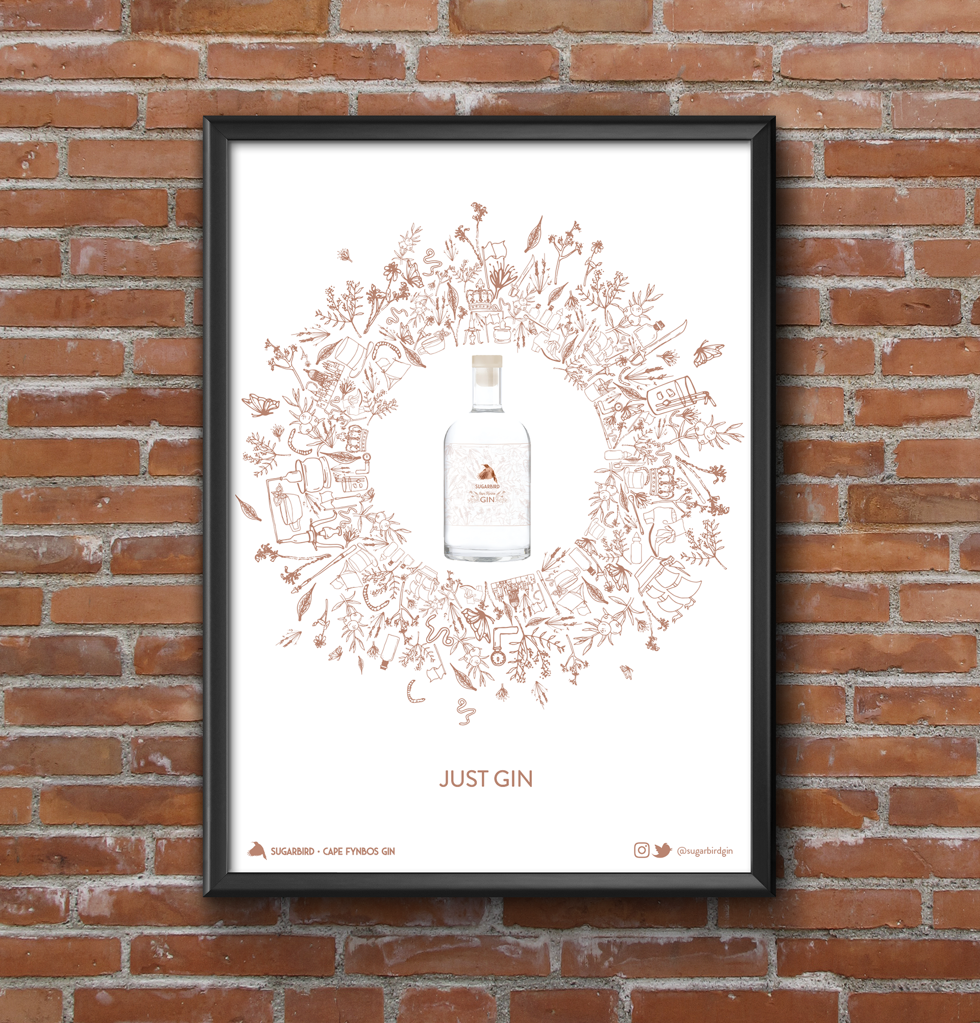
With gin’s historical and alchemic attributes, this muted colour palette yields the chance to have an iconographic approach through using signature and appropriate references. This not only provides a more holistic view on what the bottle’s contents are and the history thereof, but also have an ironic play on the brand’s slogan, “Just Gin”.
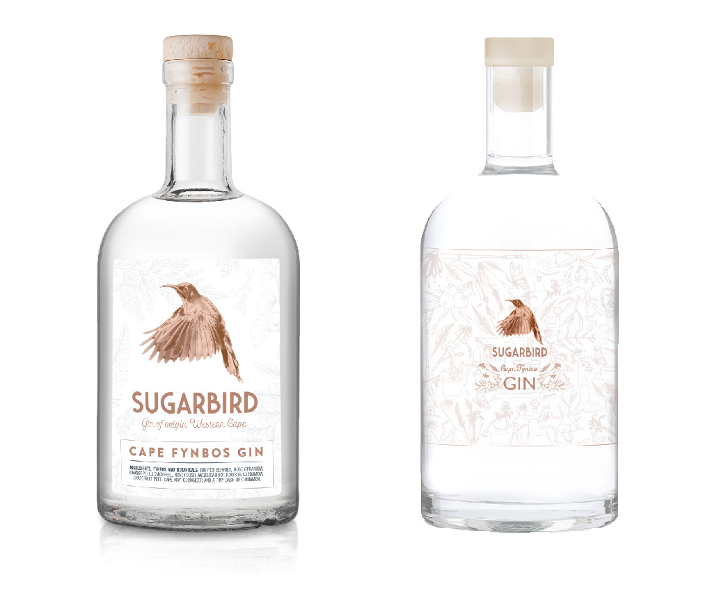
Original and proposed redesigned label.
SECONDARY PACKAGING MOCKUPS
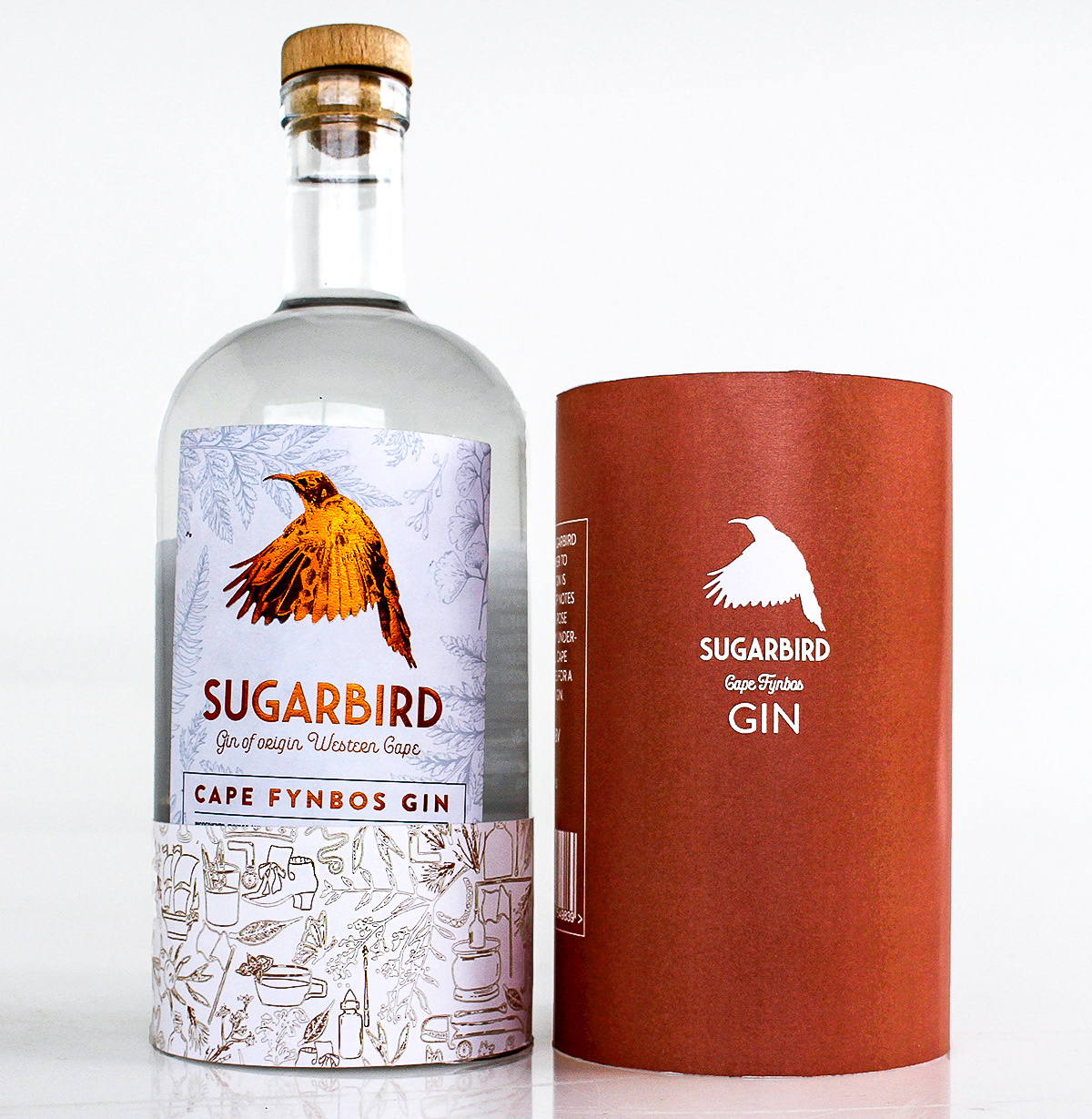
Original bottle in packaging mockup.
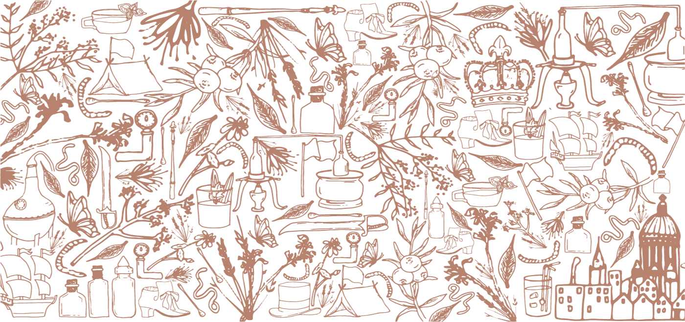
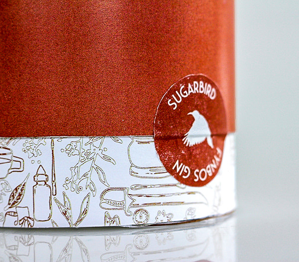
The illustration style is inspired by the original label's illustrative border.
The illustration style is inspired by the original label's illustrative border.
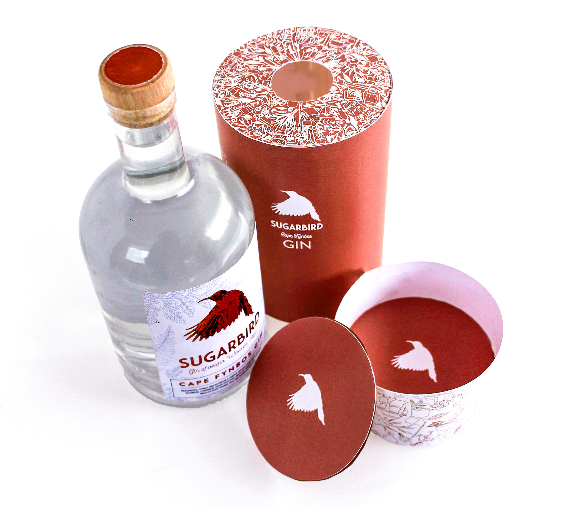
Coasters to be included underneath bottle as incentive.
POSTER MOCKUP